looking into the layouts of collections on display and the reasons for it
Below are some photographs of the collections in the Sedgewick in Cambridge. It was interesting to see how they displayed the objects and how I could consider laying out things in my 'collections' brief.
Below are some photographs of the collections in the Sedgewick in Cambridge. It was interesting to see how they displayed the objects and how I could consider laying out things in my 'collections' brief.

my sketches;
Whilst we were visiting the gallery, I used my sketchbook and a biro to draw out some quick sketches of the layouts of and what type of cases/cabinets they were displayed in for future reference to look at possible ideas I could do with my own work and how I could display things in exhibitions.

- G
gaining further knowledge and inspiration of collections through the ideas of other artists
DAVID HOCKNEY
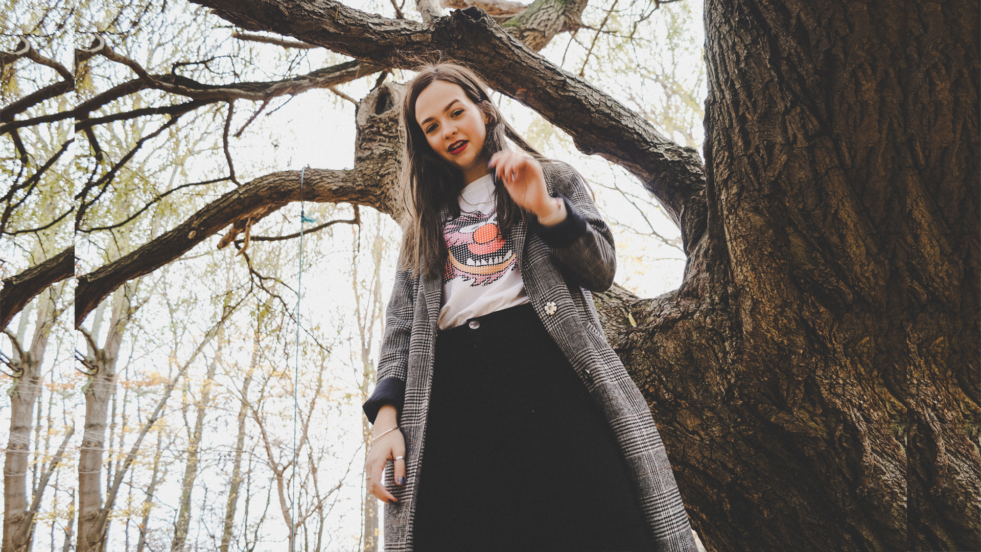
Hockney is well known for his unique work and his vibrant choice of colours. In my research in my sketchbook I explored his work and how he laid out the designs and the chosen backgrounds for each portrait. I'd like to try something similar to this with my own photography and could even try to make vivid backgrounds with printing or in photoshop.
.jpg)
DAMIEN HIRST
Damien Hurst was another artist that stood out to me in their collections work. He collects a lot of different medicine boxed and bottles and medicinal equipment and lays them out into neat rows and columns. Creating interesting layouts and organising the bottles in a very interesting way.
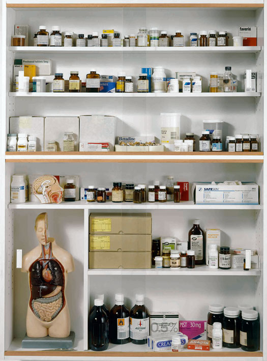
I'd like to try some similar photography like this myself but with food ingredients or components of objects broken down or taken apart.
- G
looking at something ordinary that we use daily and making it our own, utilising paper and texture
For this brief, we had the opportunity to design and make our own coffee cups. It could be made out of any material we liked and have any concepts included that we felt like. I wanted to try and design a coffee cup that was both practical and aesthetically pleasing. I began the process through mind mapping any ideas or words that popped into my head. Some main ideas that stood out to me optimised the hidden storage in the bottom of the cup by including train time tables or a pocket for a train ticket.


For this brief, we had the opportunity to design and make our own coffee cups. It could be made out of any material we liked and have any concepts included that we felt like. I wanted to try and design a coffee cup that was both practical and aesthetically pleasing. I began the process through mind mapping any ideas or words that popped into my head. Some main ideas that stood out to me optimised the hidden storage in the bottom of the cup by including train time tables or a pocket for a train ticket.
I began the experimental process through the making of templates that could wrap round the exterior of the cup, making sure to think about the usefulness of each design and what could be eco-friendly. I utilised a lot of coffee in my design to fit with the theme of a coffee cup and make stamped designs to look like the coffee rings left under a coffee cup, taking this further I took them into photoshop and manipulated the designs that way.
My final outcomes included some train ticket designs to appeal to the travelling/commuting target audience. Among with a pocket on the side of the cup for a train ticket/bus ticket and a folded napkin in case of spillage or dripping found in the base of the cup.
- G
contextualising my wearable designs into a magazine mock up
Working in Photoshop, I imported my pictures from the previous contact sheet of the wearable maquettes and used my Wacom Bamboo Tablet to outline the model and cutout the sculpture into a new layer. Making sure to leave this the main part of the design, I deleted the rest and continued to fill in the background and stuck to a continuous line drawing for the human form and blacked out the face to add more emphasis on what the subject is wearing.


- G
working with the maquettes, I explored contextualising them into wearable pieces
Now that I had some methods to use, I went on to producing a wearable sculpture, building a structure that would be gravity defying and also self supporting, so the person wearing it wouldn't have to hold it together for it work. I enjoyed working on a larger scale and facing the challenge of working with such a fragile material, at risk of easily tearing when manipulated around the human form.
 To improve this further, I intend on contextualising this design onto an illustrative magazine mock up that showcases the design and puts all focus on the textures that have been created.
Furthermore, I would like to try this again but maybe build on more elements, like things that could hang off the hands, ears, on top of the head and maybe make the sculpture a lot higher too.
- G
Now that I had some methods to use, I went on to producing a wearable sculpture, building a structure that would be gravity defying and also self supporting, so the person wearing it wouldn't have to hold it together for it work. I enjoyed working on a larger scale and facing the challenge of working with such a fragile material, at risk of easily tearing when manipulated around the human form.
Furthermore, I would like to try this again but maybe build on more elements, like things that could hang off the hands, ears, on top of the head and maybe make the sculpture a lot higher too.
- G
using the ideas from my maquettes before, I began looking for artists that did similar work to the outcomes I'd like to experiment with
 *I spelt NOA wrong in my sketchbook in this picture but it has been altered*
I really liked the work of Noa Raviv, I would like to take this as inspiration to develop my maquettes into a piece much bigger, taking the techniques and process to manipulate the paper surface and apply those into producing something that can be worn. I loved the sheer elements included in their work and the illusions that the lines created so would like to try and work on this and see what I could come up with.
- G
I really liked the work of Noa Raviv, I would like to take this as inspiration to develop my maquettes into a piece much bigger, taking the techniques and process to manipulate the paper surface and apply those into producing something that can be worn. I loved the sheer elements included in their work and the illusions that the lines created so would like to try and work on this and see what I could come up with.
- G
progressing how the maquettes could be used by creating photograms with them in the dark room


On this page, I took some of my photograms that I produced in the dark room and photocopied them, manipulating them further through weaving and folding. This gave an interesting way of making a 3-D design into a 2-D one, then bringing it back to its original form.

I also devloped these photograms further through layering in photoshop, allowing the designs to overlap and create new objects in the process.
- G
using an A2 sheet of paper, explored multiple ways of manipulating the surface and making elements 3D
For this project, I took a big A1 sheet of white paper and began to manipulate the surface in as many ways as possible to create texture, volume, shadows, sheer parts, holes, rips, tears, cuts etc. I really tried to maximise the material I had available to me and use it in lots of unconventional ways.


 With these extra materials, I went on to develop some more intricate 3-D work, maquettes made up of pleated elements and documented the shadows cast on these in the light box, using different coloured sheets of acetate over the lamp to cast different colours onto this plain, white object. It was interesting to see the shadows, contours and folds really stand out and change direction when the placement of the light source was changed. (as seen in photographs).


For this project, I took a big A1 sheet of white paper and began to manipulate the surface in as many ways as possible to create texture, volume, shadows, sheer parts, holes, rips, tears, cuts etc. I really tried to maximise the material I had available to me and use it in lots of unconventional ways.
I wanted to make a monochromatic feel to my work, making sure I kept to all things white/cream, allowing myself the extra materials - craft knife, tape, masking tape, tracing paper and cream sugar paper.
To develop my work even further, I'd like to layer in this maquette design into some photography or do some blind drawings from just feeling the texture of them.
- G
using colour palettes developed previously, explored ways of contextualising into fashion garments and home decor opportunities
Scanning in images from fashion magazines, I began to photoshop my colour schemes onto the backgrounds and on the garments themselves. The most effective layout or approach I believe is in the second picture, where I changed the colour of the garment and made the background black. Giving the item a ghost-like effect that its flowing against a non-existent body.


I'd like to try and develop this further by doing a photoshoot in the studio like this..using the lighting quite bright with a black background, creating contrast between the model and the background.
- G
Scanning in images from fashion magazines, I began to photoshop my colour schemes onto the backgrounds and on the garments themselves. The most effective layout or approach I believe is in the second picture, where I changed the colour of the garment and made the background black. Giving the item a ghost-like effect that its flowing against a non-existent body.
I'd like to try and develop this further by doing a photoshoot in the studio like this..using the lighting quite bright with a black background, creating contrast between the model and the background.
- G
mixing two complementary colours
Here, we had the opportunity to explore the different varieties of colour we could produce and the combinations that could be mixed together. I took two different primary colours and mixed the two together in different shades and tones to produce as many different colours of the same shade family as possible.
I really enjoyed this approach to colour and would like to use it again to develop possible colour schemes for inspiration in briefs or projects in the future. It helped to open up my imagination the vast amount of colours available and how by slightly changing something it can produce a totally different feel, mood or look.


 I would like to try this activity again but use more contrasting colours to produce more exciting outcomes rather than yellow and blue which I used.
- G
Here, we had the opportunity to explore the different varieties of colour we could produce and the combinations that could be mixed together. I took two different primary colours and mixed the two together in different shades and tones to produce as many different colours of the same shade family as possible.
I really enjoyed this approach to colour and would like to use it again to develop possible colour schemes for inspiration in briefs or projects in the future. It helped to open up my imagination the vast amount of colours available and how by slightly changing something it can produce a totally different feel, mood or look.
I went on to cut out small sections of each colour in order to layer and put together into different colour schemes and potential palettes for use in development (above).
Developing this further, I used to off cuts of the previous activity to layer the colours in a different way or design rather than just sticking them in a row. This allowed the colours to be displayed in a more creative way to see where they could go near each other..on the left? right? above? behind? on top? repeated? etc.
- G
Exploring film and the context in Barbarella

Exploring films in my cultural study sessions help me to open my eyes to options in creativity and all the different ideas that people have had. Barbarella had a very futuristic feel to it, its metallic garments and angular features emphasise this.
Its funky music and sound effects added with the space elements really makes the movie unique and opened me up to new ways in which I could approach presenting or creating my own work. It made me realise that creating pieces of work doesn't just involve seeing visuals but it can also include other senses such as hearing, taste, touch and smell.
In my future development I'll be looking into this further and when generating ideas and creating mind maps, I'll be mapping out more ideas like the sounds I'll use and maybe even producing things to smell along with my outcomes.
using one of my most collected items as a base for my research and design development
colour palette to work with;

Above is a small colour scheme, taking advantage of my camera I added the image into photoshop and selected the colours digitally for a change.
development in different methods and types of media
development in different methods and types of media

outcome in illustrator and photoshop

Above, I used Adobe Illustrator to explore how I could create train tickets digitally and make them into a piece of art or into a pattern. I feel it was successful because it looked liked the original subject I was trying to transcript. To improve on this further, I would like to try this printed on a bigger scale and also do some more documentation from the journeys that I go on.
- G-
- G-