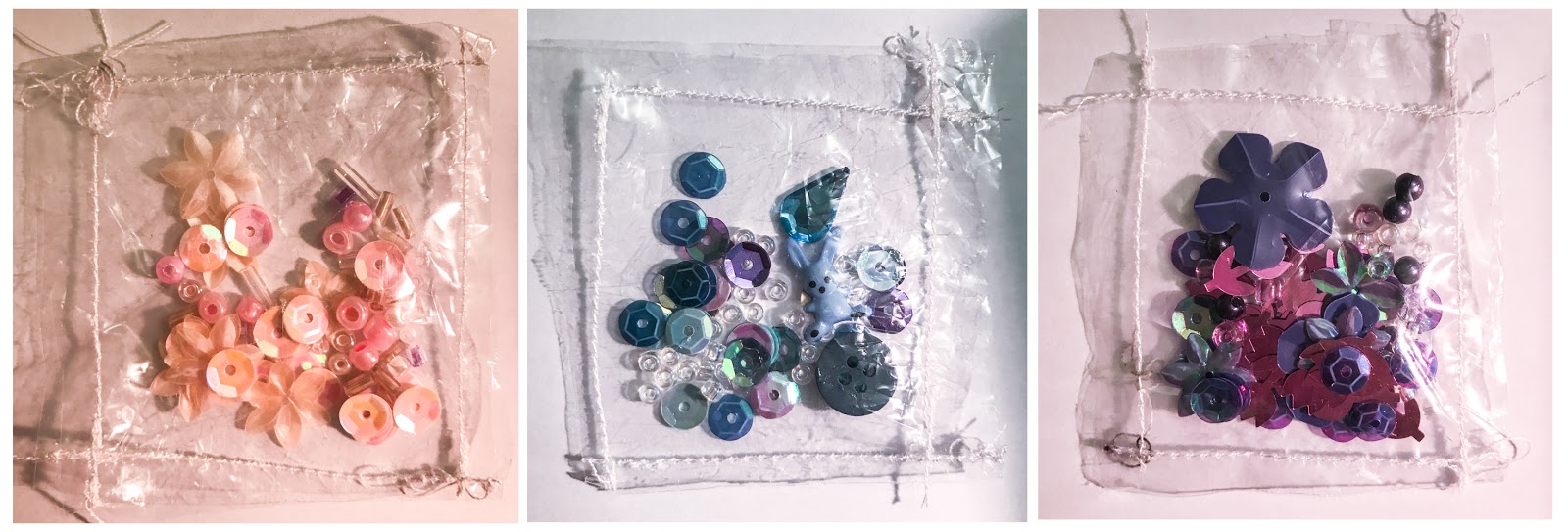
exploring monochromatic colour schemes and showing the contextualisation of these onto clothing
For this, I wanted to explore the use of juxtaposition in a subtle way; looking into contrast in the shades of certain colours/textures. I looked at contrast in small objects and collected these together in small, clear stitched pockets; looking at shades of pink, blue and purple.

Then, I've taken pictures of this from my sketchbook and contextualised this back into magazine pages and overlaid it on clothing to show how it could be used in the industry.
To improve this further, I would try to somehow create a print from the designs at the top in the clear bags onto fabric and try to create the designs physically.
- G
To improve this further, I would try to somehow create a print from the designs at the top in the clear bags onto fabric and try to create the designs physically.
- G


0 comments