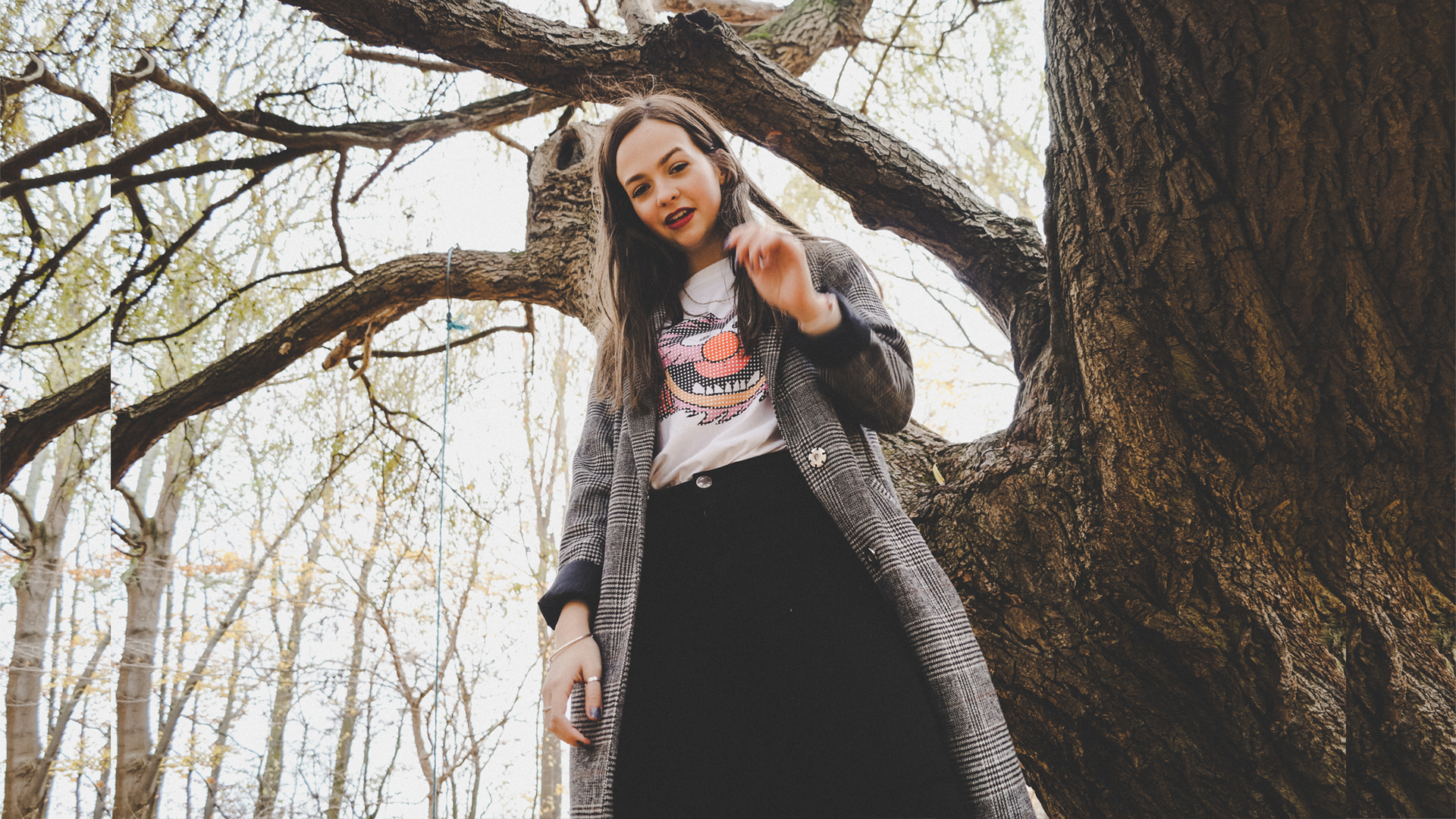
Photoshoot Inspiration, exploring pastel tones and collaging
By Georgia - March 18, 2018
gathering ideas for future photoshoots and exploring use of colour tones and collaging techniques
After gathering some ideas of what I would like to explore in this project and the types of colours/textures I would like to include, I started to research things similar to what I'd like to create. I wanted to try and explore things such as block colour backgrounds in studio shoots, shadow/light play, gel lighting and colour overlays in post processing. I also wanted to try and look at doing paint pouring/water marbling to create psychedelic patterns such as that in the 70s.
Then, I went on to use various materials to gather together in a visual moodboard/layout of patterns/colours/textures that worked in juxtaposition to one another. Then, using tracing paper I drew multiple different garments of clothing that I could swap out and layer on top of the collages to contextualise the design and work as an interesting way to display how an outfit could look or be designed.
To improve my work further on these pages, I would try more colours and layouts and also try working on a bigger scale, trying to create a series of layouts all consisting with a certain theme/link/colour scheme. For example, could be the juxtaposition of how green looks against orange and then I could create 3 or 4 designs using the two colours but in different tones, layouts, textures etc...then I could contextualise further.
- G
- G


0 comments