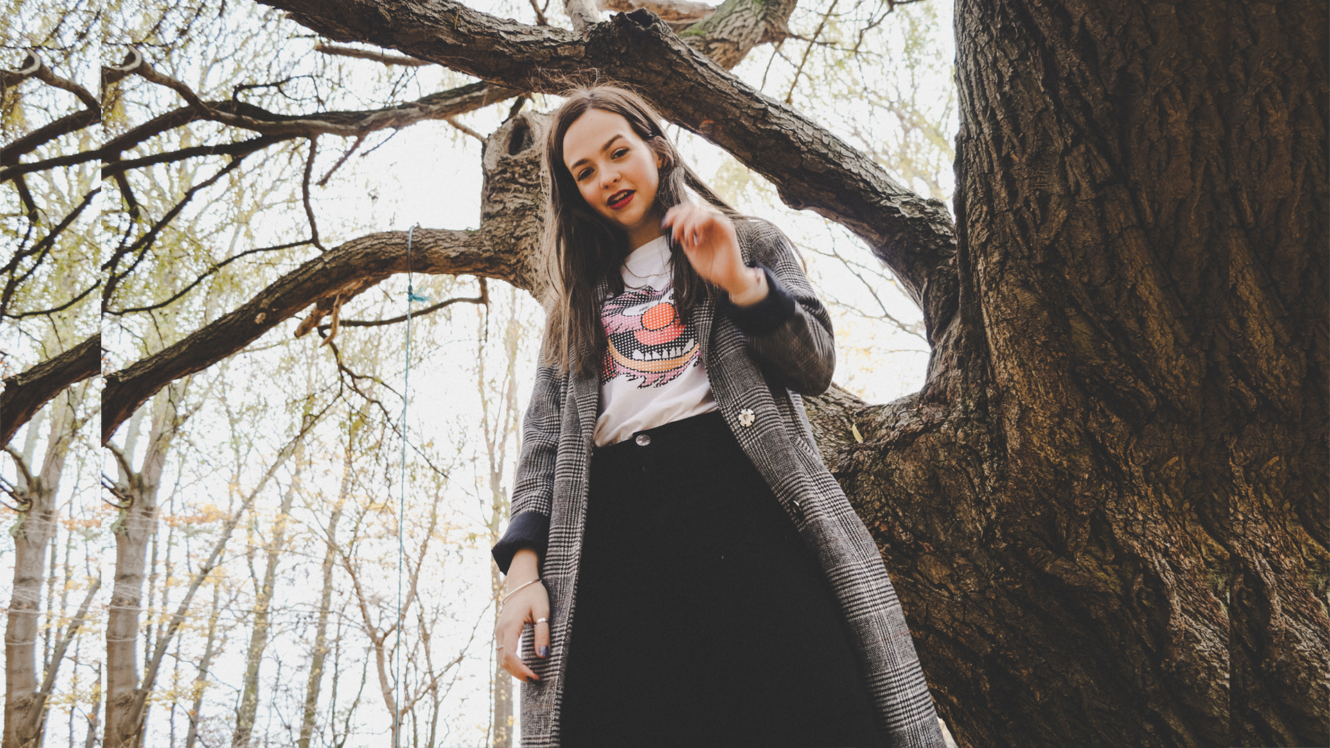
exploring the use of colour/lighting in a home studio setup to capture portraits in natural lighting From the contact sheet above from the shoot, I went through and chose my favourite selections. Importing them into Lightroom, I went on to colour correct and brighten the images, making sure to crush shadows/blacks in editing and make them look less harsh. Then, I went on...


documenting people interacting with one another/objects/doing daily tasks through drawing/continuous line drawings I used a black biro to do the majority of these drawings as it was a quick, easily accessible medium to use when drawing people out and about. It also gave a continuous line thickness that made the drawings appear very consistent. To experiment further, I would like to try different...


for this, I took the mark making I made before when listening to music and pictures of the shoot with Natalie with the light interacting I feel like the most effective edits were the lighter edits where the colours were brighter and had a white backdrop instead of dark. This particular edit reminds of neon lighting-I could explore this in the lighting exhibition...


with the brief 'interaction' I also wanted to explore our senses and things interact every day or in things that we don't think are working together but they are I started by creating a mind map of the 5 senses and what they might do or mean; I decided that I wanted to explore the interaction of sound so I did some mark...


beginning to start exploring my ideas and the use of light to cast coloured shadows and how this could be manipulated in portrait photography Using my phone, a white background and some colourful filters over one small lamp, I was able to create some interesting effects and shadows casted across the face and upper body. The way that the light split into different...


Exploring ideas in the form of a mind map On this starting page of the project I begin by brain storming as many ideas as to what I think of the word 'Interaction'. To me there are obvious ideas I could go with but there are also a lot of hidden routes that could be explored, ones that require more thought to go...


collecting ideas together for a stop motion idea and the final product and reasoning behind concept For this task, we were given the brief to create a stop motion linking to our current project and to work in small groups. For this stop motion, we wanted to explore colour and contrast in the lighting/tones to link to my project and then to...


doing a photoshoot inspired by the research and experimentation so far and also layering the wool felting samples that I made earlier back on to the photographs by snanning into Adobe photoshop Below are some edits of my chosen selections, experimenting with adding gradient overlays and grain to create interest and break apart the yellow in the photo. Using my scans of the...


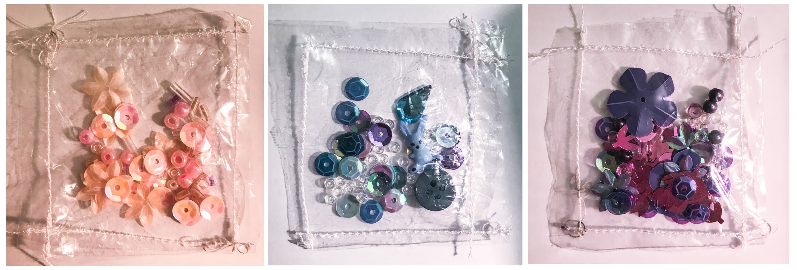
exploring monochromatic colour schemes and showing the contextualisation of these onto clothing For this, I wanted to explore the use of juxtaposition in a subtle way; looking into contrast in the shades of certain colours/textures. I looked at contrast in small objects and collected these together in small, clear stitched pockets; looking at shades of pink, blue and purple. Then, I've taken pictures...


developing the samples further through editing and then contextualising the designs made onto clothing Here, I took some of the paint designs that I made before and enlarged them in Photoshop to edit them further. I really liked the effect produced when inverting the colours of the design, so I did this a few times to see how it would look with different...


exploring colour in a different way - making my own fabric through felting wool with an embroidering needle and machine For this idea, I wanted to explore creating my own fabric samples using different contrasting colours of felting wool. I found this experiment to be very successful and the colours were very vivid and effective to what I wanted to achieve. I tried multiple...


exploring how one colour can be used in designs - looking into shade, texture and pattern and also looking into creating own colours/patterns using poster paint Below, I wanted to look how juxtaposition could be explored subtly through use of tone in one colour and how this could be put into my own work/drawings. Sketching from observation, I drew this portrait which I...
Photoshoot Inspiration, exploring pastel tones and collaging
By Georgia - March 18, 2018


gathering ideas for future photoshoots and exploring use of colour tones and collaging techniques After gathering some ideas of what I would like to explore in this project and the types of colours/textures I would like to include, I started to research things similar to what I'd like to create. I wanted to try and explore things such as block colour backgrounds in...


looking into the title 'juxtaposition' and gathering ideas and research into what i'd like to achieve in this project I've collected a range of images and fabrics/materials that I feel relate to the title of juxtaposition and of what I believe juxtaposition to be. My idea of juxtaposition was to explore contrast, in colour, pattern, texture etc. I researched a lot into fashion...


delving deeper into what 'transparency' means and how it can link through the media As I was developing my work through different techniques and methods as seen previously, I began to look into how transparency could be applied in the media. For example how much transparency there is in how things are portrayed and exploring if secrets are kept and uncovering scandals/news. I...